Table of Contents
Hello everyone welcome to this new article where we are going to take a loot at React Native Stylesheet Styling.
Stylesheet styling in react native is the main method you can use to add styles to your app, it’s based on CSS, with tiny differences. In most cases you will find the react native stylesheet properties identical to CSS.
Quick example
React Native Stylesheet
{
  backgroundColor: "red"
}
CSS
{
  background-color : red
}
As you can see the only different is the way it’s written, stylesheet takes a camel case naming, but the property’s values are the same.
Another difference between the two styling concepts, is how the styles are applied, with css you can create classes or inline styling for styles and stylesheet, you only have one option which is the inline styling.
To take the styling to the maximum level we will try to create a Blog Post Styling Example App and style multiple component.

First let’s see hoe does the stylesheet work.
React Native Stylesheet Basic Usage
Stylesheet API comes with the React Native package, all we need is to import it directly.
import { StyleSheet } from 'react-native';Then we can use Stylesheet.create() method to initiate a new stylesheet. The code below, will create a new stylesheet and add a styling property container with a backgroundColor of #fff value, which is a short code for a white color.
const styles = StyleSheet.create({
  container: {
    backgroundColor: "#fff"
  }
})
You can add new component styles similar to the container, there is no limit to how many you can add. You can also split the into smaller pieces and import them etc.
Let’s dive deeper and create an app example using stylesheets.
Blog Post Styling App
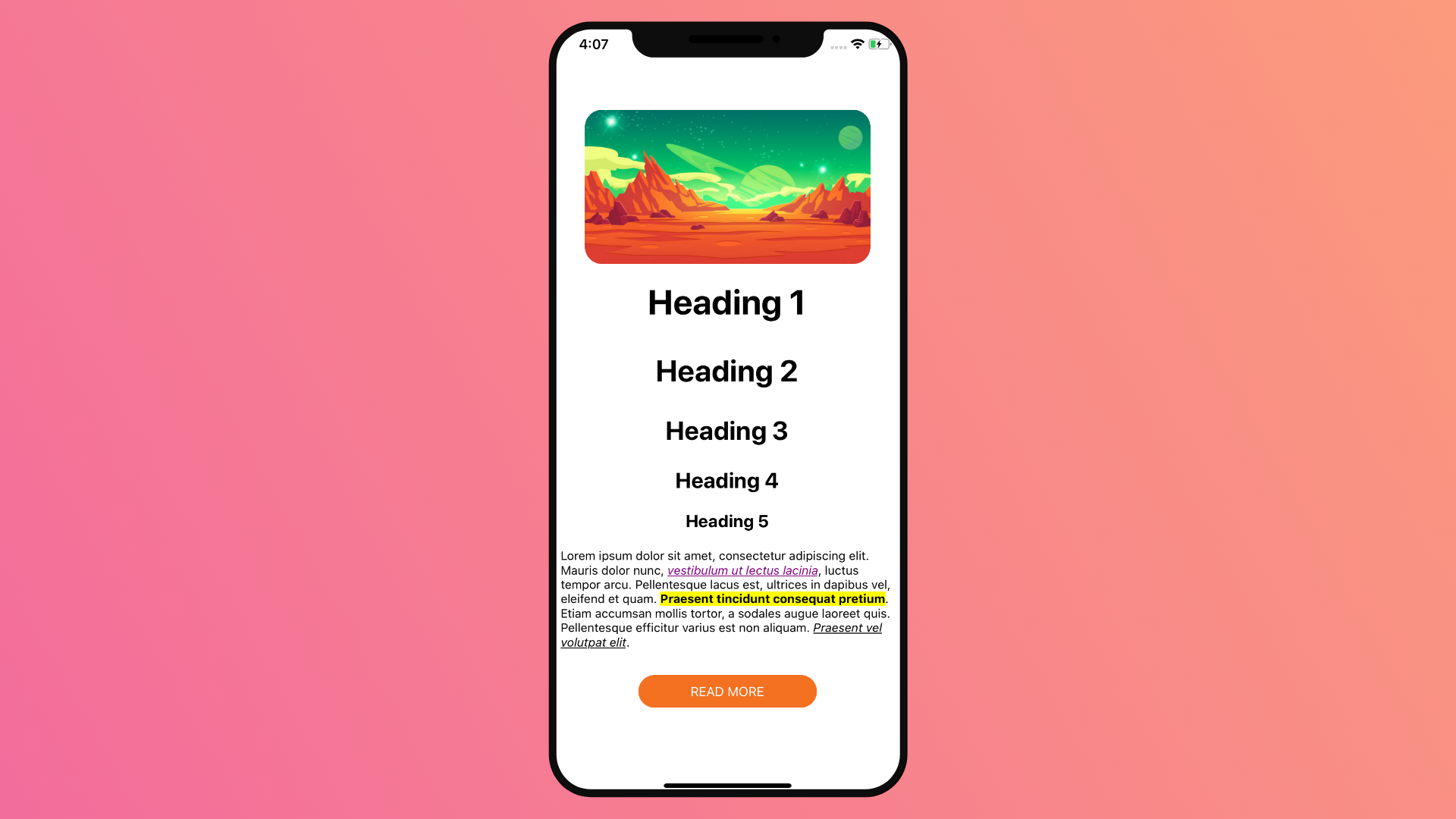
The app we will be building, is similar to the Blog post styling guides you see in almost any blog.
Each Blog Post have unique styles to that site, as an example you can see Headings in a blog in red and other blogs black, with underlines etc.
To mimic that, in our app example we will style 4 parts. An Image, Headings H1 to H5, Paragraph and a Button. On the paragraph side, we will includes 3 different text styling properties. A highlight text, Link and a visited link.
Full Code
import { StatusBar } from 'expo-status-bar';
import React from 'react';
import { StyleSheet, Text, View, Image, TouchableOpacity } from 'react-native';

export default function App() {
  const imageUrl = 'https://image.freepik.com/free-vector/mars-landscape-alien-planet-martian-background_107791-1781.jpg'
  return (
    <View style={styles.container}>
      <Image
        source={{uri: imageUrl}}
        style={styles.image}
      />
      <Text style={styles.h1}>Heading 1</Text>
      <Text style={styles.h2}>Heading 2</Text>
      <Text style={styles.h3}>Heading 3</Text>
      <Text style={styles.h4}>Heading 4</Text>
      <Text style={styles.h5}>Heading 5</Text>
      <Text style={styles.paragraph}>
        Lorem ipsum dolor sit amet, consectetur adipiscing elit. Mauris dolor nunc, <Text style={styles.visitedlinkText}>vestibulum ut lectus lacinia</Text>, luctus tempor arcu. Pellentesque lacus est, ultrices in dapibus vel, eleifend et quam. <Text style={styles.highlightedText}>Praesent tincidunt consequat pretium</Text>. Etiam accumsan mollis tortor, a sodales augue laoreet quis. Pellentesque efficitur varius est non aliquam. <Text style={styles.linkText}>Praesent vel volutpat elit</Text>.
      </Text>
      <TouchableOpacity style={styles.readMoreBtn}>
        <Text style={styles.readMoreBtnTxt}>Read More</Text>
      </TouchableOpacity>
      <StatusBar style="auto" />
    </View>
  );
}

const styles = StyleSheet.create({
  container: {
    flex: 1,
    backgroundColor: '#fff',
    alignItems: 'center',
    justifyContent: 'center',
  },
  image:{
    width: '80%',
    height: '20%',
    borderRadius: 20
  },
  h1: {
    fontSize: 40,
    fontWeight: "bold",
    margin: 20
  },
  h2: {
    fontSize: 35,
    fontWeight: "bold",
    margin: 15
  },
  h3: {
    fontSize: 30,
    fontWeight: "bold",
    margin: 15
  },
  h4: {
    fontSize: 25,
    fontWeight: "bold",
    margin: 10
  },
  h5: {
    fontSize: 20,
    fontWeight: "bold",
    margin: 10
  },
  paragraph: {
    padding:10
  },
  highlightedText: {
    fontWeight: "bold",
    backgroundColor: "yellow",
  },
  linkText: {
    fontStyle: "italic",
    textDecorationLine: "underline",
  },
  visitedlinkText: {
    fontStyle: "italic",
    textDecorationLine: "underline",
    color: "purple"
  },
  readMoreBtn: {
    marginTop:20,
    backgroundColor:"#f37121",
    padding: 10,
    borderRadius: 20,
    width: "50%",
    alignItems: "center"
  },
  readMoreBtnTxt: {
    color:"white",
    textTransform: "uppercase",
    fontSize: 15
  }
});
Final Result