Table of Contents
Hello everyone, Welcome To this React Native App Tutorial, where are going to Make a new app from scratch based on an Adobe XD design.

App Concept
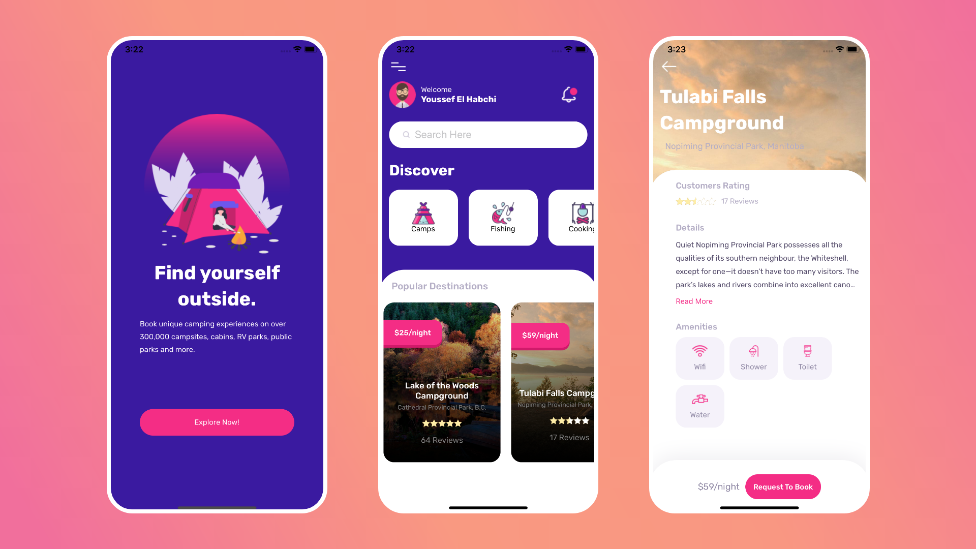
The React Native Example we will be building is a simple camping app, made up of 3 screens.
Splash Screen: Made up of a quick introduction to the app, a camping illustration and a navigation button so get started.
Home Screen:
- Made up of multiple components, starting at the top with the Navigation drawer icon.
- Header, with user profile, including his/her name, his/her profile image and a notification bell icon button.
- Search area
- Discover Area with a list of camping sites and destination categories, example fishing and hiking etc
- Horizontal list of the destination sites, with quick info including a title, location, rating and reviews.
Details Screen: Full destination sites details, with a title and location
- short/full description expandable by interaction with read more button
- List of amenities available within the camping destination
- Finally the price and a booking button
Getting Starting
To get started we need few stuff installed, for this project I will be using Expo cli, but feel free to follow along by using React Native Cli.
Installation
Expo Cli:
npm install -g expo-cliReact Native Cli:
npm install -g react-native-cliYou can find full details of the installation process from the official Docs
Setup a new environment
Setting up a new project is simple and almost similar for both approaches, you get it started by init from a new folder.
expo init AwesomeProject
cd AwesomeProject
npm start # you can also use: expo start
once the process finishes, you project App.js will look something similar to this.
import React from 'react';
import { StyleSheet, Text, View } from 'react-native';

export default class App extends React.Component {
  render(){
    return (
      <View style={styles.container}>
        <Text>Open up App.js to start working on your app!</Text>
      </View>
    );
  }

}

const styles = StyleSheet.create({
  container: {
    flex: 1,
    backgroundColor: '#fff',
    alignItems: 'center',
    justifyContent: 'center',
  },
});

Project Structure
Usually when I start a new React Naive project, I have a personal Project structure that I like to follow to stay organize.
It’s not the best optimal structuring approach, but It’s simple and can be extended.
Most of the action resides within the src folder.
Straight within the src folder I add a config.js file, where I add config variables I use. Including colorings, API endpoints and authentication, API Keys etc.
For this project I will only be adding colors and base API endpoint (Which I created using NodeJs and ExpressJs).
export default config = {
  colors: {
    accent: "#F72585",
    primary: "#3A0CA3",
    secondary: "#2F0F79"
  },
  baseUrl: "http://192.168.1.21:3000"

}
Connecting to the server from an emulator or physical device
As I have mentioned, the baseUrl, is the API endpoint I have setup with Express and NodeJs. Which is running In the local host.
Since I am using an emulator (Sometimes physical device) to test the App, I will have to include the IP address of my laptop in the network, wether it’s wifi network or anything. This way any device in the network can connect to the API. In our case the emulator.
Besides the config.js, I add a folder named screens where I will add app screens and it’s components.
As an example The Home screen will have a default component and it’s child components like Discover Categories list etc
The final Structure will look like this.
src/

    config.js

    screens/

           Home/

                Home.js

                Components/

                           DiscoverList.js

                           DiscoverListItem.js
Beyond the src file, I add all my assets to the assets folder generated by expo on the same level as src.
Setting up react native navigation
The first thing we’ll need to setup before starting to code, is the app navigation.
As we are planning to add 3 screens to the app, and move between them, react native navigation becomes mandatory.
So we will start by the installation and integration.
Installation
npm install @react-navigation/nativeWe also need to install Expo dependencies for managed projects
expo install react-native-gesture-handler react-native-reanimated react-native-screens react-native-safe-area-context @react-native-community/masked-viewUsing React native cli, the command will be.
npm install react-native-reanimated react-native-gesture-handler react-native-screens react-native-safe-area-context @react-native-community/masked-view
for react Native 0.60, linking is done automatically, if not run
react-native linkIf you are on a mac, you need to install Cocoapods to handle the linking
npx pod-install iosAnd finally we will have to include the gesture handler, if not the app may crash. We can do so in our root file, in our case App.js.
import 'react-native-gesture-handler';Hooking screens into navigation stack
The first let’s import our dependencies.
import * as React from 'react';
import { NavigationContainer } from '@react-navigation/native';
import { createStackNavigator } from '@react-navigation/stack';
After that, Let’s create placeholder screens to integrate to the navigation stack.
Within the src/screens, create 3 react natvie components, Splash.js, Home.js, Details.js.
Then import them.
// screens
import Home from "./src/screens/Home/Home"
import Splash from "./src/screens/Splash"
import Details from "./src/screens/Details/Details"
const Stack = createStackNavigator();
const App = () => {
return (
<NavigationContainer>
<Stack.Navigator>
<Stack.Screen options={{headerShown: false}} name="Splash" component={Splash} />
<Stack.Screen options={{headerShown: false}} name="Home" component={Home} />
<Stack.Screen options={{headerShown: false}} name="Details" component={Details} />
</Stack.Navigator>
</NavigationContainer>
);
};
export default App;Now we let’s create a Stack Navigation, which the screens will be attached to.
This won’t work by itself, so we need to include it as a child of a Navigation container.
Within the stack navigation, we can setup our screens one by one, each with a name, component and options props.
For this app, I want my components to be full screen without the default header, so an option headerShown: false will be added to take care of that.
And finally, we export the App.
Splash Screen
The first screen we will dive into is the Splash screen, which serves as the star point of our app.
By itself it doesn’t contain complex functionality, such as navigation to the home screen, it will be pure styling.
Since the Splash screen is the starting point of the app, it will have a main role of loading the font’s we will be using in the entire app.
Let’s get started by importing our dependencies.
import { StatusBar } from 'expo-status-bar';
import React from 'react';
import { StyleSheet, Text, View, Image, TouchableOpacity } from 'react-native';
import config from "../config"
import { useFonts, Rubik_700Bold, Rubik_400Regular, Rubik_500Medium } from '@expo-google-fonts/rubik';
import { AppLoading } from 'expo';
From react native we will need basic components such as StatusBar and Text etc, we will also need to import the config.js, which has the primary colors.
Plus the AppLoading from Expo. Which we will use to display and hide the splash screen if the fonts or any assets are not yet loaded.
Finally the fonts them selves which are needed to be installed first.
The Font I will be using is Rubik, by google fonts.
Install custom google fonts
expo install expo-font @expo-google-fonts/rubikLet’s get back the the import statement, as you might have notice we are importing useFont and multiple variations of the font itself which we will be using for different Text components within the app.
Splash Components

Our root component will be simple like this.
export default function Splash({ navigation }) {
  let [fontsLoaded] = useFonts({
    Rubik_700Bold,
    Rubik_400Regular,
    Rubik_500Medium
  });

  if (!fontsLoaded) {
    return <AppLoading />;
  }
  return (
    <View style={styles.container}>
      <StatusBar style="auto" />
      <Image
        style={styles.Image}
        source={require("../../assets/SplashImg.png")} />
      <Text style={styles.title}>Find yourself  outside.</Text>
      <Text style={styles.body}>
        Book unique camping experiences on over 300,000 campsites, cabins, RV parks, public parks and more.
      </Text>
      <TouchableOpacity
          style={styles.exploreBtn}
          onPress={()=> navigation.navigate('Home')}
        >
          <Text style={styles.exploreBtnTxt}>Explore Now!</Text>
      </TouchableOpacity>
    </View>
  );
}
let’s try to check whats going on here.
The navigation prop, is passed from the Stack navigation, it includes various functions we can use to navigate, such as navigate() or goBack().
Then we are loading the needed fonts using useFont, which returns a boolean fontsLoaded, indicating whether the given font’s are fully loaded.
NOTICE: You only need to load the font’s once in your app, then use then anywhere. You do not need to import them into every component.
And the next statement checks the loading status and renders AppLoading component.
And finally the render method which renders what will be displayed.
For our screen, we need to include the StatusBar info and how we want to behave, you can remove it if you want.
Next the Image illustration, which is already saved within the assets folder.
The Title and description texts, and finally the Navigation button to navigate to the next screen, in this case the Home screen.
And here you can find the styling details of each component.
const styles = StyleSheet.create({
  container: {
    flex: 1,
    backgroundColor: config.colors.primary,
    alignItems: 'center',
    justifyContent: 'center',
  },
  Image: {
    width:274,
    height:274
  },
  title:{
    fontSize:36,
    fontWeight:"bold",
    color:"white",
    width:"70%",
    textAlign:"center",
    fontFamily:"Rubik_700Bold",
    marginBottom:10,
    lineHeight:49
  },
  body: {
    width:"70%",
    color:"white",
    fontSize:14,
    fontFamily:"Rubik_400Regular",
    lineHeight:24
  },
  exploreBtn:{
    width:"70%",
    backgroundColor:config.colors.accent,
    height:50,
    borderRadius:25,
    justifyContent:"center",
    alignItems:"center",
    marginTop:100
  },
  exploreBtnTxt: {
    color:"white",
    fontFamily:"Rubik_400Regular",
  }
});
Home Screen

The home screen will serve as our main app screen, this is where a user lands, after opening the app.
Here a user can view a list of camping sites destinations, and interact with it. Along with few more options.
At the top, the header area, we have listed a drawer navigation button, a quick snippet about the user, his profile photo and name, and a notification bell button.
Bellow we will add a search input area, where a user can execute search queries.
A discover area, where a user can filter the camping site destinations by its category, which is presented as a list of icons and texts related to each category.
And finally the main destinations listing, which is presented as a list as well, which quick overview about each site.
To get started let’s make a new folder within the src/screens folder, and add a Home.js file, with a child folder named Components.
After importing our dependencies, The Home screen will look like this after we finish
export default function App({ navigation}) {
  const [searchQuery, setSearchQuery] = useState("")
  return (
    <View style={styles.container}>
      <StatusBar style="auto" />
      <View  style={{width:"90%"}}>
        <TouchableOpacity>
          <Image style={styles.drawerIc} source={require("../../../assets/drawerMenu.png")} />
        </TouchableOpacity>
      </View>
      <View style={styles.header}>
        <View style={{flexDirection:"row"}}>
          <Image style={styles.headerIc} source={require("../../../assets/profileImg.png")} />
          <View style={styles.headerInfo}>
            <Text style={styles.headerWelcome}>Welcome</Text>
            <Text style={styles.headerProfile}>Youssef El Habchi</Text>
          </View>
        </View>
        <TouchableOpacity>
          <Image style={styles.headerIc} source={require("../../../assets/bell.png")} />
        </TouchableOpacity>
      </View>
      <View style={styles.inputView}>
        <Image style={{width:13, height: 13}} source={require("../../../assets/search.png")} />
        <TextInput
          onChangeText = {(query) => setSearchQuery(query)}
          style={styles.input}
          placeholder = "Search Here"
          autoCorrect={false}
          underlineColorAndroid='transparent'
          showSoftInputOnFocus={false}
        />
      </View>
      <View style={{width:"90%"}}>
        <Text style={styles.discoverTxt}>Discover</Text>
      </View>
      <DiscoverList />
      <View style={styles.destinationsView}>
        <Text style={styles.destinationsTxt}>Popular Destinations</Text>
        <DestinationsList navigation={navigation} />
      </View>


    </View>
  );
}
Header Area
This screen will only use one state, for search query from the search input, so we can have that as a useState hook.
const [searchQuery, setSearchQuery] = useState("")So that we can use on onChangeText to update the query state.
Navigation Drawer
Starting from the top, the first view is the Navigation drawer view, within the header part. Which only consists of an Icon button.
      <View  style={{width:"90%"}}>
        <TouchableOpacity>
          <Image style={styles.drawerIc} source={require("../../../assets/drawerMenu.png")} />
        </TouchableOpacity>
      </View>
Profile info area
The next view within the header, profile info.
Which 3 child parts, the profile image, profile name and welcome message and finally the notification bell.
      <View style={styles.header}>
        <View style={{flexDirection:"row"}}>
          <Image style={styles.headerIc} source={require("../../../assets/profileImg.png")} />
          <View style={styles.headerInfo}>
            <Text style={styles.headerWelcome}>Welcome</Text>
            <Text style={styles.headerProfile}>Youssef El Habchi</Text>
          </View>
        </View>
        <TouchableOpacity>
          <Image style={styles.headerIc} source={require("../../../assets/bell.png")} />
        </TouchableOpacity>
      </View>
Search query Input
Below the header, we get into the search input view, with a simple search icon and TextInput View.
Here within the TextInput, We can update the query state after the users finishes writing the query, we can also add an api call to retrieve the new list, but we wont do so within this article.
<View style={styles.inputView}>
        <Image style={{width:13, height: 13}} source={require("../../../assets/search.png")} />
        <TextInput
          onChangeText = {(query) => setSearchQuery(query)}
          style={styles.input}
          placeholder = "Search Here"
          autoCorrect={false}
          underlineColorAndroid='transparent'
          showSoftInputOnFocus={false}
        />
      </View>
Discover Area
Now we get into some advanced stuff, The Discover Area.
Which consist of 2 parts, the header, and the categories list.
The title is pretty straight forward, Just a simple textview.
      <View style={{width:"90%"}}>
        <Text style={styles.discoverTxt}>Discover</Text>
      </View>
      <DiscoverList />
Then we add a new Component which we will create next, called <DiscoverList />.
we will get into this later this chapter.
Destinations Area
Next is the Destinations area, which also consist of a title and a list.
      <View style={styles.destinationsView}>
        <Text style={styles.destinationsTxt}>Popular Destinations</Text>
        <DestinationsList navigation={navigation} />
      </View>
Similar to the DiscoverList, we will cover this part later.
And finally the styling.
const styles = StyleSheet.create({
  container: {
    flex: 1,
    backgroundColor: config.colors.primary,
    alignItems: 'center',
    paddingTop:40
  },
  drawerIc: {
    width: 35,
    height:35
  },
  headerIc:{
    width:50,
    height:50,
    marginRight:10
  },
  header:{
    flexDirection:"row",
    marginTop:10,
    justifyContent:"space-between",
    width:"90%",
    marginBottom:25
  },
  headerInfo:{
    justifyContent:"center",
  },
  headerWelcome:{
    color:"white",
    fontFamily:"Rubik_400Regular",
  },
  headerProfile:{
    color:"white",
    fontFamily:"Rubik_700Bold",
    fontSize: 16
  },
  inputView:{
    backgroundColor:"white",
    width:"90%",
    height:50,
    borderRadius:25,
    justifyContent:"center",
    alignItems:"center",
    flexDirection:"row",
    marginBottom: 25
  },
  input: {
    width:"80%",
    height:45,
    marginLeft:10,
    fontSize:20,
  },
  discoverTxt: {
    fontFamily:"Rubik_700Bold",
    fontWeight:"bold",
    fontSize: 28,
    color:"white",
    marginBottom:20
  },
  destinationsView:{
    backgroundColor:"white",
    borderTopRightRadius: 50,
    borderTopLeftRadius: 50,
    width:"100%",
    flex:1,
  },
  destinationsTxt:{
    fontFamily:"Rubik_500Medium",
    fontSize: 18,
    color:"#B4ADC6",
    fontWeight:"bold",
    marginVertical:20,
    paddingLeft: 25
  }
})
DiscoverList
We will do so by creating 2 new files DiscoverList.js and DiscoverListItem.js within the components folder next to Home.js.
On the DiscoverList.js we create a new React Component and export it with the name DisoverList after importing all react and react native dependencies.
This component will be different. wince we will be doing an API call using Axios
if you do not already have it, install it using
yarn add axioswe will also be using the useEffect hook.
The final version will look like this.
const DisoverList = () => {
  const [discoverItems, setDiscoverItems] = useState([])

  useEffect(() => {
    fetchData = async() => {
      const destinationListUrl = `${config.baseUrl}/discover`
      let list = []
      try {
        list = await axios.get(destinationListUrl)
      } catch (error) {
        console.log("error", error.message, destinationListUrl)
      }
      setDiscoverItems(list.data)
    }
    fetchData()

  },[]);

  const renderItem = ( { item }) =>  {
    return [
      <DiscoverListItem
        key={item.id+ ''}
        item={item}
        onPress={() => console.log(item.title)}
      />
    ]
  }

  return (
    <SafeAreaView style={styles.container}>
      <FlatList
        horizontal={true}
        data={discoverItems}
        renderItem={renderItem}
        showsHorizontalScrollIndicator={false}
      />
    </SafeAreaView>
  )
}
Starting with the state, lets add discover items.
const [discoverItems, setDiscoverItems] = useState([])
using the useEffect hook, we can setup our api call to get the items data needed.
  useEffect(() => {
    fetchData = async() => {
      const destinationListUrl = `${config.baseUrl}/discover`
      let list = []
      try {
        list = await axios.get(destinationListUrl)
      } catch (error) {
        console.log("error", error.message, destinationListUrl)
      }
      setDiscoverItems(list.data)
    }
    fetchData()

  },[]);
Within useEffect, we will create a a function fetchData, which will take care of all API related call stuff, including error handling and state update.
Finally the useEffect hook, needs a second argument of an empty array, to simulate the onComponentMount() lifecycle method.
Next we will add an item component for our list, which we already created a file for DiscoverListItem.js.
  const renderItem = ( { item }) =>  {
    return [
      <DiscoverListItem
        key={item.id+ ''}
        item={item}
        onPress={() => console.log(item.title)}
      />
    ]
  }
Finally render method, where we will connect everything together.
return (
    <SafeAreaView style={styles.container}>
      <FlatList
        horizontal={true}
        data={discoverItems}
        renderItem={renderItem}
        showsHorizontalScrollIndicator={false}
      />
    </SafeAreaView>
  )
Here, we are using a Flatlist within a safeAreaSearch Component. With a horizontal prop, data from the state which we will get from the API call, and renderItem
plus the styling which is just a container.
const styles = StyleSheet.create({
  container: {
    height:150,
    marginLeft:20,
  },
});
DiscoverListItem
Now Let’s dive into DiscoverListItem.js
This component is a Simple UI Component with a sole role of rendering the category items, it consists of a title and an Icon. Which we will get from the DiscoverList
const DisoverListItem = ({ item, onPress }) => {
  return (
    <TouchableOpacity onPress={onPress} style={styles.item}>
      <Image
        source={{uri: `${config.baseUrl}/${item.ic}`}}
        style={styles.image}
        />
      <Text style={styles.title}>{item.title}</Text>
    </TouchableOpacity>
  )
}
Styles
const styles = StyleSheet.create({
  item: {
    width:130,
    height: 105,
    backgroundColor: "white",
    borderRadius: 20,
    justifyContent:"center",
    alignItems:"center",
    marginRight:20
  },
  title: {

  },
  image: {
    width:42,
    height:42
  }
});
Destinations Area
This part of the screen will have a title and a list, listing the destination sites of the app.
Similar to the discover area, It will load the app data from an API endpoint using the React native useEffect hook, and render the example list.
We will get starting by creating 2 files for our components, DestinationsList.js and DestinationsListItem.js
So let’s get started
DestinationsList
The final version of the Component will look like this
const DestinationsList = ({ navigation}) => {
  const [destinationsItems, setDestinationsItems] = useState([])

  useEffect(() => {
    fetchData = async() => {
      const discoverListUrl = `${config.baseUrl}/destinations`
      let list = []
      try {
        list = await axios.get(discoverListUrl)
      } catch (error) {
        console.log("error", error.message, discoverListUrl)
      }
      setDestinationsItems(list.data)
    }
    fetchData()

  },[]);


  const renderItem = ( { item }) =>  {
    return [
      <DestinationsListItem
        key={item.id+''}
        item={item}
        onPress={() => navigation.navigate("Details", { item })}
      />
    ]
  }

  return (
    <FlatList
        style={styles.container}
        horizontal={true}
        data={destinationsItems}
        renderItem={renderItem}
        showsHorizontalScrollIndicator={false}
      />
  )
}
The first element we encounter is the Navigation prop, which we didn’t have in the discover List. This navigation prop, we get from the react navigation, in order to transition from one screen to another. Which we need to do, when a user clicks on a destination item, the app will transit to the details screen.
Next the state of the component, in this case we only need one to save the list of destinations from the api call.
const [destinationsItems, setDestinationsItems] = useState([])Similar to the DiscoverList, we will use useEffect to handle the api call, once the component mounted. it has the same setup from the DiscoverList check it out.
  useEffect(() => {
    fetchData = async() => {
      const discoverListUrl = `${config.baseUrl}/destinations`
      let list = []
      try {
        list = await axios.get(discoverListUrl)
      } catch (error) {
        console.log("error", error.message, discoverListUrl)
      }
      setDestinationsItems(list.data)
    }
    fetchData()

  },[]);
Next the render item for our list
  const renderItem = ( { item }) =>  {
    return [
      <DestinationsListItem
        key={item.id+''}
        item={item}
        onPress={() => navigation.navigate("Details", { item })}
      />
    ]
  }
and finally the style and render method
  return (
      <FlatList
          style={styles.container}
          horizontal={true}
          data={destinationsItems}
          renderItem={renderItem}
          showsHorizontalScrollIndicator={false}
        />
    )
const styles = StyleSheet.create({
container: {
paddingLeft:10
}
});Details Screen

The details screen will have the full details about the selected destination and an option to book.
Starting at the top, we can see a simple header, with a back button and the destination title, plus the destination location.
As you might have noticed, the background of the screen, is the same as the destination photo, which add an elegant look to the details screen.
Below, we have 4 sections of destinations details.
Customer Rating: A star rating system and the total user reviews of the destination.
Details: detailed description of the destination, with an option to load more.
Amenities: The list of amenities, as a list and icons. eg. wifi, shower…
Booking: Booking button with price per night for every destination.
The overall code for the details screen, will look like this.
import React, {useState} from 'react';
import { StyleSheet, Text, View, Image, TouchableOpacity, ImageBackground } from 'react-native';
import { ScrollView } from 'react-native-gesture-handler';
import config from "../../config"
import Rating from "../Components/Rating"
import AmenitiesList from "./Components/AmenitiesList"
export default function App({ navigation, route}) {
  const { item } = route.params
  const [readMore, setReadMore] = useState(false)
  return (
    <ImageBackground
      source={{uri: `${config.baseUrl}/${item.photo}`}}
      style={styles.container}
      resizeMode='cover'
    >
      <View  style={styles.leftSpace}>
        <TouchableOpacity onPress={() => navigation.goBack()} >
          <Image style={styles.drawerIc} source={require("../../../assets/arrowBack.png")} />
        </TouchableOpacity>
      </View>
      <View style={styles.leftSpace}>
        <Text style={styles.title}>{item.title}</Text>
        <Text style={styles.location}>{item.location}</Text>
      </View>
      <ScrollView style={styles.detailsView}>
        <Text style={styles.label}>Customers Rating</Text>
        <View style={styles.reviewView}>
          <Rating rating={item.rating} />
          <Text style={styles.reviewsTxt}>{`${item.reviews} Reviews`}</Text>
        </View>
        <Text style={styles.label}>Details</Text>
        <View style={styles.descriptionView}>
          <Text
            numberOfLines={readMore ? 0 : 4}
            style={styles.descriptionTxt}
            >
            {item.description}
          </Text>
          <TouchableOpacity onPress={() => setReadMore(!readMore)}>
            <Text style={styles.readMoreTxt}>Read More</Text>
          </TouchableOpacity>
        </View>
        <Text style={styles.label}>Amenities</Text>
        <View style={styles.descriptionView}>
          <AmenitiesList amenities={item.amenities}/>
        </View>

      </ScrollView>
      <View style={styles.bookingContainer}>
        <View style={styles.bookingView}>
          <Text style={styles.priceTxt}>{`$${item.price}/night`}</Text>
          <TouchableOpacity style={styles.bookingBtn}>
            <Text style={styles.bookingBtnTxt}>Request To Book</Text>
          </TouchableOpacity>
        </View>
        </View>
    </ImageBackground>
  );
}
The first thing you will notice, is that the Details component, has an ImageBackground, which will add the destination as a background of the screen component.
And works similar to the normal Image component.
<ImageBackground
      source={{uri: `${config.baseUrl}/${item.photo}`}}
      style={styles.container}
      resizeMode='cover'
    >
Header Area
The header area consists of 3 parts, one back navigation button a title and a location.
<View  style={styles.leftSpace}>
        <TouchableOpacity onPress={() => navigation.goBack()} >
          <Image style={styles.drawerIc} source={require("../../../assets/arrowBack.png")} />
        </TouchableOpacity>
      </View>
      <View style={styles.leftSpace}>
        <Text style={styles.title}>{item.title}</Text>
        <Text style={styles.location}>{item.location}</Text>
      </View>
Details Area
The details area consist of 4 sections, each showing different destination details. Wrapped within a ScrollView
Customer Rating
For the sake of this tutorial, we have created an easy React Native custom Rating component Example for our app. The concept is to show a filled, half filled or empty star icon based on the rating of the destination, as follows.
import React from 'react';
import {View, Image, StyleSheet } from 'react-native';

const Rating = ({rating}) => {
  const starFilled = 'https://reactnativemaster.com/wp-content/uploads/2020/09/starFiller.png';
  const starEMpty = 'https://reactnativemaster.com/wp-content/uploads/2020/09/starEmpty.png';
  const starHalfEmpty = 'https://reactnativemaster.com/wp-content/uploads/2020/09/starHalfEmpty.png';

  let ratingStars = []


  // add filled stars
  for (let i = 0; i < parseInt(rating); i++) {
    ratingStars.push(
      <Image
        style={styles.starImage}
        source={{ uri: starFilled }}
        key= {new Date().getTime() + Math.random()+""}
    />)
  }
  // add half empty star
  if ( rating % 1 != 0) {
    ratingStars.push(
      <Image
        style={styles.starImage}
        source={{ uri: starHalfEmpty }}
        key= {new Date().getTime() + Math.random()+""}

    />)
  }
  // add empty stars
  for (let i = 0; i < parseInt(5 - rating); i++) {
    ratingStars.push(
      <Image
        style={styles.starImage}
        source={{ uri: starEMpty }}
        key= {new Date().getTime() + Math.random()+""}

    />)

  }

  return (
    <View
      style={styles.container}>
        {
          ratingStars
        }
    </View>
  )
}

const styles = StyleSheet.create({
  container:{
    flexDirection: "row",
    marginVertical: 15,
  },
  starImage: {
    width: 15,
    height: 15
  }
})
export default Rating;
And a customer reviews, which is just a simple text.
        <Text style={styles.label}>Customers Rating</Text>
        <View style={styles.reviewView}>
          <Rating rating={item.rating} />
          <Text style={styles.reviewsTxt}>{`${item.reviews} Reviews`}</Text>
        </View>
Details Area
Here we can see the full description of the destination with an option to show full details or a short description.
Fir this app, we are going to create a read more example state and control the numberOfLines of the React Native textView.
At the top of the component add the readMore State.
const [readMore, setReadMore] = useState(false)
And use it as follows.
<Text style={styles.label}>Details</Text>
        <View style={styles.descriptionView}>
          <Text
            numberOfLines={readMore ? 0 : 4}
            style={styles.descriptionTxt}
            >
            {item.description}
          </Text>
          <TouchableOpacity onPress={() => setReadMore(!readMore)}>
            <Text style={styles.readMoreTxt}>Read More</Text>
          </TouchableOpacity>
        </View>
Amenities Area
This section renders the list of amenities available in every destination.
The Amenities component consist of AmenitiesList.js and AmenitiesListItem.js.
Which are listview component and its render Item. Similar to the discoverList on the home screen. It renders the icon of and title of the amenities.
import React, { useState, useEffect } from "react";
import { FlatList, SafeAreaView, StyleSheet } from "react-native";
import DiscoverListItem from "./AmenitiesListItem"
import axios from "axios"
import config from "../../../config"


const AmenitiesList = ({ amenities }) => {


  const renderItem = ( { item }) =>  {
    return [
      <DiscoverListItem
        key={item}
        item={item}
      />
    ]
  }

  return (
    <FlatList
        numColumns={3}
        data={amenities}
        renderItem={renderItem}
        showsHorizontalScrollIndicator={false}
        scrollEnabled={false}
      />
  )
}


export default AmenitiesList
import React, { useState } from "react";
import { TouchableOpacity, Text, StyleSheet, Image } from "react-native";
import config from "../../../config"
const AmenitiesList = ({ item, onPress }) => {
return (
<TouchableOpacity onPress={onPress} style={styles.item}>
<Image
resizeMode="contain"
source={{uri: `${config.baseUrl}/images/amenities/${item}.png`}}
style={styles.image}
/>
<Text style={styles.label}>{item}</Text>
</TouchableOpacity>
)
}
const styles = StyleSheet.create({
item: {
width:91,
height: 80,
backgroundColor: "#F5F2FA",
borderRadius: 20,
justifyContent:"center",
alignItems:"center",
marginRight:10,
marginBottom:10
},
image: {
width:30,
height:22
},
label: {
color: "#8F87A5",
fontFamily: "Rubik_400Regular",
textAlign:"center",
fontSize:14,
paddingTop: 10
}
});
export default AmenitiesListBooking Area
The booking area consists of two section, a price per night display for each destination and a booking button.
The entire section has a box shadow, which adds an elegant look to the area.
<View style={styles.bookingContainer}>
        <View style={styles.bookingView}>
          <Text style={styles.priceTxt}>{`$${item.price}/night`}</Text>
          <TouchableOpacity style={styles.bookingBtn}>
            <Text style={styles.bookingBtnTxt}>Request To Book</Text>
          </TouchableOpacity>
        </View>
      </View>
And finally The styling.
const styles = StyleSheet.create({
  container: {
    flex: 1,
    width:"100%",
    height:"100%",
    paddingTop:40,

  },
  leftSpace: {
    marginBottom: 15,
    paddingLeft: 20
  },
  backIc: {
    width: 35,
    height:35
  },
  title: {
    fontSize:36,
    fontWeight:"bold",
    color:"white",
    textAlign:"left",
    fontFamily:"Rubik_700Bold",
    marginBottom:10,
    lineHeight:49
  },
  location: {
    color:"#B4ADC6",
    fontFamily: "Rubik_400Regular",
    textAlign:"left",
    fontSize:16,
    paddingHorizontal: 10
  },
  detailsView: {
    backgroundColor:"white",
    borderTopRightRadius: 50,
    borderTopLeftRadius: 50,
    width:"100%",
    flex:1,
    paddingLeft:25,
    marginTop: 20,
    paddingTop: 10
  },
  label: {
    fontFamily:"Rubik_500Medium",
    fontSize: 16,
    color:"#B4ADC6",
    fontWeight:"bold",
    paddingLeft: 25,
    paddingVertical:10
  },
  reviewView: {
    flexDirection: "row",
    alignItems:"center",
    paddingLeft: 25,
    marginBottom:20,
    height: 20
  },
  descriptionView: {
    paddingLeft: 25,
    marginBottom:20,
  },
  reviewsTxt: {
    color:"#B4ADC6",
    fontFamily: "Rubik_400Regular",
    textAlign:"left",
    fontSize:14,
    paddingLeft: 10
  },
  descriptionTxt:{
    color: "#4E4466",
    fontFamily: "Rubik_400Regular",
    textAlign:"left",
    fontSize:14,
    textAlign: "left",
    paddingRight:20,
    lineHeight: 25,
    marginBottom: 10
  },
  readMoreTxt: {
    color: config.colors.accent,
  },
  bookingContainer:{
    backgroundColor:"white",
    width:"100%",
    height:100,
  },
  bookingView: {
    justifyContent:"center",
    alignItems:"center",
    flexDirection:"row",
    height:100,
    backgroundColor:"white",
    borderTopRightRadius: 50,
    borderTopLeftRadius: 50,
    shadowColor: "#4E4466",
    shadowOffset: {
      width: 0,
      height: -5,
    },
    shadowOpacity: .1,
    shadowRadius: 20,
    elevation: 8,
  },
  priceTxt: {
    color:"#8F87A5",
    fontFamily: "Rubik_400Regular",
    fontSize:17,
  },
  bookingBtn: {
    backgroundColor:config.colors.accent,
    borderRadius: 30,
    padding: 15,
    marginLeft: 10
  },
  bookingBtnTxt:{
    color: "white",
    fontFamily:"Rubik_500Medium",
    fontSize: 14,
  }
})
Conclusion
That was it for this React Native App Tutorial, I hope you enjoyed every bit of it and found it as informative as you have expected.
This project will be available on github and Expo.io
Frontend, backend and expo.io
Feel free to comment out your questions and concerns don’t be shy.
Thank your for reading my article and happy coding.
can u please provide your rest api endpoit’s source codefor this project
Hi,
Its already on github.
Check it here : https://github.com/Alhydra/React-Native-App-Example-Camping-App-Project-backend
thank you sir