Table of Contents
Hello everyone, welcome into this article where we are going make a React Native Modal Example, with simple and good looking UI.
This Modal example can be using in various ways to show a component above your usual content.
Or to receive action based feedback for users, such as accepting or allowing something.
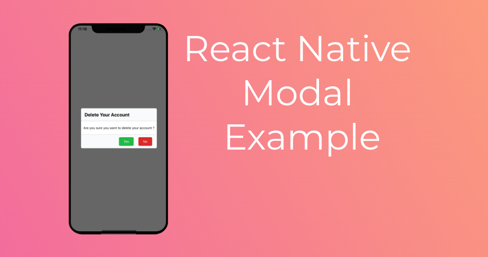
The Result will be looking like this.

Let’s Get Started
To make a modal in your app, you will need to use the React Native Modal API.
The concept is pretty simple, you will have a modal component that you can hide or display.
You can make it look whatever way you want, so in this article we are going to make something familiar.
Something most of you have already came a cross, The delete popup modal.
When you try to remove something in a given website, a modal will came up to confirm your delete action.
Thats exactly what you will try to build.
So we will split the modal view into 3 parts, Header, Body, and Footer.
The header will contain a title of the modal message.
The body will contain a text body with error or message details.
And the Footer will have 2 buttons to confirm the deletion or cancel and dismiss the modal.
First lets setup our initial state
const [modalVisible, setModalVisible] = useState(false);Header
const modalHeader=(
    <View style={styles.modalHeader}>
      <Text style={styles.title}>Delete Your Account</Text>
      <View style={styles.divider}></View>
    </View>
)
This snippet is for the header, with a title Text view, and a divider view at the bottom.
Body
  const modalBody=(
    <View style={styles.modalBody}>
      <Text style={styles.bodyText}>Are you sure you want to delete your account ?</Text>
    </View>
  )
Body is where we are going to display message details, we can even go further and add an image.
Footer
  const modalFooter=(
    <View style={styles.modalFooter}>
      <View style={styles.divider}></View>
      <View style={{flexDirection:"row-reverse",margin:10}}>
        <TouchableOpacity style={{...styles.actions,backgroundColor:"#db2828"}}
          onPress={() => {
            setModalVisible(!modalVisible);
          }}>
          <Text style={styles.actionText}>No</Text>
        </TouchableOpacity>
        <TouchableOpacity style={{...styles.actions,backgroundColor:"#21ba45"}}>
          <Text style={styles.actionText}>Yes</Text>
        </TouchableOpacity>
      </View>
    </View>
  )
And finally the Footer.
It has a divider view like in the header, plus 2 buttons for confirmation and cancellation.
and we will put all these components together in a container view so that we can put it inside the final modal.
  const modalContainer=(
    <View style={styles.modalContainer}>
      {modalHeader}
      {modalBody}
      {modalFooter}
    </View>
  )
Modal
  const modal = (
    <Modal
      transparent={false}
      visible={modalVisible}
      onRequestClose={() => {
        Alert.alert('Modal has been closed.');
      }}>
      <View style={styles.modal}>
        <View>
          {modalContainer}
        </View>
      </View>
    </Modal>
)
The Modal component, can have multiple props to change the feel end experience of it.
As an example you can add animations.
animationType
The animationType prop controls how the modal animates.
slideslides in from the bottomfadefades into viewnoneappears without an animation
Default is set to none.
But I will keep it default.
Now add the modal into your render method.
  return (
    <View style={styles.container}>

      {modal}

      <TouchableOpacity
        onPress={() => {
          setModalVisible(true);
        }}>
        <Text>Show Modal</Text>
      </TouchableOpacity>
    </View>
  );
And finally the styles
const styles = StyleSheet.create({
  container: {
    flex: 1,
    backgroundColor: '#fff',
    alignItems: 'center',
    justifyContent: 'center',
  },
  modal:{
    backgroundColor:"#00000099",
    flex:1,
    alignItems: 'center',
    justifyContent: 'center',
  },
  modalContainer:{
    backgroundColor:"#f9fafb",
    width:"80%",
    borderRadius:5
  },
  modalHeader:{

  },
  title:{
    fontWeight:"bold",
    fontSize:20,
    padding:15,
    color:"#000"
  },
  divider:{
    width:"100%",
    height:1,
    backgroundColor:"lightgray"
  },
  modalBody:{
    backgroundColor:"#fff",
    paddingVertical:20,
    paddingHorizontal:10
  },
  modalFooter:{
  },
  actions:{
    borderRadius:5,
    marginHorizontal:10,
    paddingVertical:10,
    paddingHorizontal:20
  },
  actionText:{
    color:"#fff"
  }
});
And there you have it a React Native Modal example with clean and modern UI.

I hope you find this article as informative as you have expected.
Feel free to share it with your friends, and comment out your questions and concerns.
As usual I will add this project to github and expo.io for you to use.
Stay tuned for more.
Happy coding.
Hey man, Just wanted to thank you for the article it helped a lot.
Keep up the good work!