Table of Contents
Hello everyone, welcome into my new article, where we explore how to make a React Native Progress Dialog.
Using simple React Native and no libraries.
Usually as a part of any App’s UI and UX you will find yourself giving user feedback for their interactions.
As an example when the app is fetching data from an API, a good UI usage would be a Loading progress dialog.
So that’s what we will try to build.
Simple React Native Progress Dialog, with native platform UI/UX.
Concept
The concept is to have a simple Pop up controlled via the state, to show and hide, based on the user interaction.
As an example, when a user is waiting for the app to fetch data from an Api.
The Loading UI, can be either a spinning circle or a progress bar.
Plus some texts, like the Title, and maybe a description text for the action the user had.
For the sack of simplicity, we will have a simple progress dialog, with a title and a spinner, using native UI on both android and IOS.
Let’s Get Started
To get started, we will need to import 2 APIs from React Native, Modal to make components pop up over others.
And, ActivityIndicator which includes native UI for loading activities.
We can start by adding the state and function to handle the dialog visibility.
  state = {
    modalVisible: true,
  };

  setModalVisible(visible) {
    this.setState({ modalVisible: visible });
  }
Next, add the modal to our root view, you can use it as a variable or add it directly to your render method.
And that’s what I am going to do.
        <Modal
          visible={this.state.modalVisible}>
          <View style={{ flex:1,backgroundColor:"#00000020", justifyContent:"center",alignItems:"center"}}>
            <View style={{backgroundColor:"white",padding:10,borderRadius:5, width:"80%", alignItems:"center"}}>
              <Text style={styles.progressHeader}>Loading...</Text>
              <ActivityIndicator size="large" color="#f35588"/>
            </View>
          </View>
        </Modal>
As you might have noticed I have added 2 components tp the modal View
The header of the progress dialog, saying Loading…
And the ActivityIndicator to show the loading UI, with 2 very describing props, color and size.
If you check the style of the root view inside the modal, you might have noticed the style backgroundColor.
As you can seen the color “#00000020” has 8 digits instead of 6. If you do not recognize it by now.
The last 2 digits hold the Alpha value of the color, it will make it transparent by 20%.
Which is the effect we want on our progress dialog, it will darken the background and focus only on the dialog.
If you want to increase the background’s darkness, you can increase the last 2 values.
It’s a percentage so you have a range of 0 to 100.
I am sticking to 20, because it’s light weight and achieves a good looking.
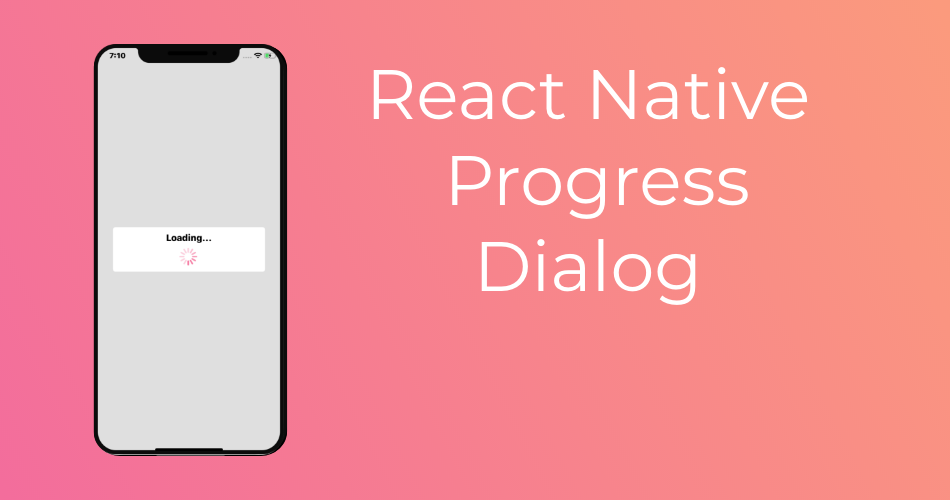
This is Result on both IOS and Android


And there you have it a simple React Native Progress Dialog, simple and using vanilla React native.
You can customize it all you want.
Take care and Happy Coding.