Table of Contents
Hello everyone, welcome to this new article, where we are going to explore React Native Shadow Box UI concept.
This is a pretty common why to make Cards in Mobile apps.
On Web, it’s pretty straight forward you can Css, but mobile is a bit different for every platform.
Without further talk, let’s dig into it.
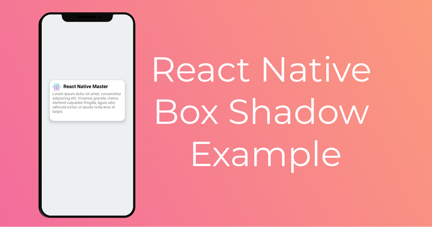
This is the Result we will try to achieve for this example.

The Concept
The concept is pretty simple, you only need to add one or more fields to the stylesheet depending on the platform, And you will end up with a shadow view.
Android
For android shadow, It’s just adding the property Elevation with a value.
card: {
    elevation: 5
}
More information, docs
IOS
The Ios box shadow, is more customisable and very similar to web css.
card: {
    shadowColor: '#000',
    shadowOffset: { width: 0, height: 3 },
    shadowOpacity: 0.5,
    shadowRadius: 5,
}
To be safe, you could use both properties for IOS and Android, and the device will render the platform specific properties and ignore the rest.
Like rgis
card: {
    shadowColor: '#000',
    shadowOffset: { width: 0, height: 3 },
    shadowOpacity: 0.5,
    shadowRadius: 5,
    elevation: 5
}
Let’s Get Started
For our react native box shadow example as you have seen in the result photo.
We will try to make a simple card view to render a title, logo and a body text, with a box shadow view.
it could be used like a social media post or blog post.
So the element will have two parts, the header section and the body section.
Let’s get started by the card container View.
It will be have these style props
card:{
    height:150,
    width:"80%",
    backgroundColor:"white",
    borderRadius:15,
    padding:10,
    elevation:10,
    shadowColor: '#000',
    shadowOffset: { width: 0, height: 3 },
    shadowOpacity: 0.5,
    shadowRadius: 5,
  }
Profile image styles
profileImg:{
    width:30,
    height:30,
    borderRadius:50,
    marginRight:10,
  },
The texts will only have a prop or two so I Always include them directly, instead of using a new property for the stylesheet.
The whole app.js code will look something like this.
import * as React from 'react';
import { Text, View, StyleSheet, Image } from 'react-native';
import Constants from 'expo-constants';
const profileImg ="https://reactnativemaster.com/wp-content/uploads/2019/11/React-native-master-logo-only.png"

export default class App extends React.Component {
  render() {
    return (
      <View style={styles.container}>
        <View style={styles.card}>
          <View style={styles.header}>
            <Image style={styles.profileImg} source={{uri: profileImg}} />
            <Text style={{fontWeight:"bold",fontSize:18}}>React Native Master</Text>
          </View>
          <Text style={{color:"gray"}}>Lorem ipsum dolor sit amet, consectetur adipiscing elit. Vivamus gravida, metus eleifend vulputate fringilla, ligula odio vehicula tortor, ut iaculis nulla eros id turpis. </Text>
        </View>
      </View>
    );
  }
}

const styles = StyleSheet.create({
  container: {
    flex: 1,
    justifyContent: 'center',
    paddingTop: Constants.statusBarHeight,
    backgroundColor: '#ecf0f1',
    padding: 8,
    alignItems:"center"
  },
  card:{
    height:150,
    width:"80%",
    backgroundColor:"white",
    borderRadius:15,
    elevation:10,
    padding:10
  },
  profileImg:{
    width:30,
    height:30,
    borderRadius:50,
    marginRight:10,
  },
  header: {
    flexDirection:"row",
  }
});
React Native Shadow Box Generator
If you are not sure how box shadows work and want to have a visual interactive view of it, there is this small tool tool.
It’s pretty simple, you just drag the slider and Shadow Generator will output the code you need to add to your shadow view stylesheet, for both IOS and android.
And there you have it a pretty simple React Native Shadow Box View example for your card elements.
I hope you like this article and find it as informative as you have expected.
Feel free to share it with your friends, and comment out your questions and concerns.
Stay tuned for more,
Happy coding
Thanks for you great post!