Table of Contents
Hello everyone, In this article we are going to explore how we can build an elegant accordion expendable list item with React Native.
Introduction
If you are not familiar with the term, an accordion is an expendable list of items, once expended, it shows detailed content.
An example of can be seen in some app menus or categories, where the sub categories are hidden till the parent menu is expended.
In our example we will try to build a quick app, displaying a list of user expenses for every month.
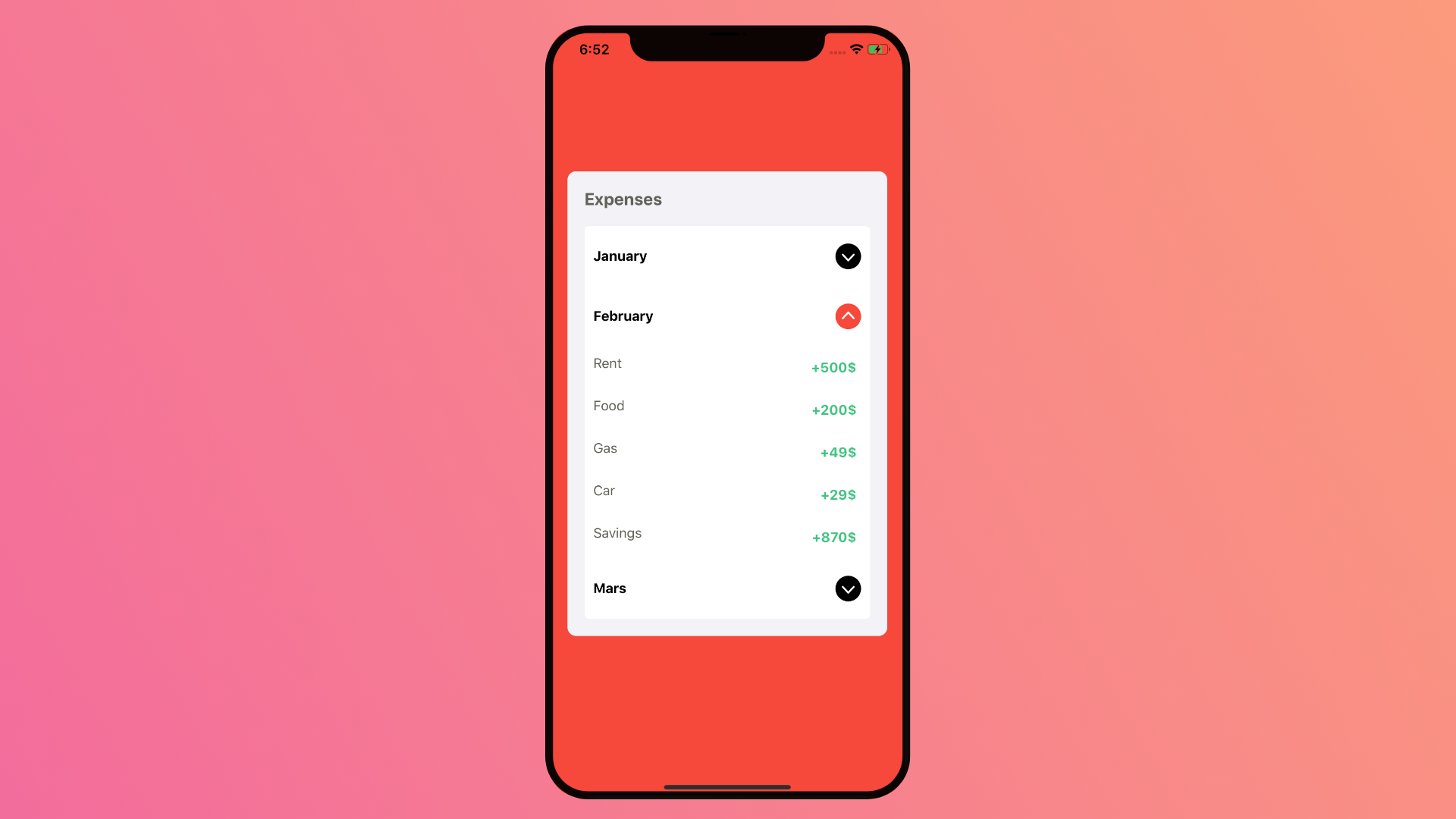
The final result will look like this.

Without further due, let’s get started.
Environment Setup
To setup this app, first we will need to make a new project either using Expo or react native cli. Both approaches will have a similar starting point.
Next, we need an accordion library, we can develop it from scratch on our own using a Flatlist, it won’t defer, but I have chosen to go with Native base.
Let’s get started by installing the dependencies, for extra information about native base setup. Visit their docs page at https://docs.nativebase.io/docs/GetStarted.html.
yarn add native-baseIf you are using react native cli, you need to link this library.
react-native linkFor Expo this should be fine, but you need to install the google fonts using expo.
expo install expo-fontAccordion Component
Native Base UI library includes a pretty Accordion component, it works cross-platform and easy to setup.
To use it all you need is to add a dataArray prop and it should work out of the blue.
<Accordion dataArray={dataArray} />const dataArray = [
{ title: "First Element", content: "First Element Content" },
{ title: "Second Element", content: "Second Element Content" },
{ title: "Third Element", content: "Third Element Content" }
];The component will automatically use the title as the header and the content as its hidden detailed content.
Building The Custom Accordion
For our app, we are going to make a custom header and content for the Accordion.
The Goal is to make an adaptable Icon for every state of accordion, where it changes the Icon and its color.
Plus we want the content to be displayed as a list with different styles.
App state
Our state will have 3 important element, isReady, expended and data.
IsReady has nothing to do with our app, but it’s important for native base to work, check the docs for more information.
expended where where are going to keep track of what element is expended, its handy for our Icon adaptaion.
And the data is the list of elements and content we will be displaying in our Accordion.
this.state = {
      isReady: false,
      expended: 0,
      data: [
        {
          id:1,
          month: 'January',
          expenses: [
            {
              name: 'Rent',
              value: 500,

            },
            {
              name: 'Food',
              value: 230,
            },
            {
              name: 'Gas',
              value: 57,
            },
            {
              name: 'Car',
              value: 0,
            },
            {
              name: 'Savings',
              value: 717
            }
          ]
        },
        {
          id:2,
          month: 'February',
          expenses: [
            {
              name: 'Rent',
              value: 500,

            },
            {
              name: 'Food',
              value: 200,
            },
            {
              name: 'Gas',
              value: 49,
            },
            {
              name: 'Car',
              value: 29,
            },
            {
              name: 'Savings',
              value: 870
            }
          ]
        },
        {
          id:3,
          month: 'Mars',
          expenses: [
            {
              name: 'Rent',
              value: 500,

            },
            {
              name: 'Food',
              value: 231,
            },
            {
              name: 'Gas',
              value: 56,
            },
            {
              name: 'Car',
              value: 17,
            },
            {
              name: 'Savings',
              value: 760
            }
          ]
        }
      ]
    };
Render Components
Our Accordion design will have two component to be specific, A title and an accordion.
With styles depending on the view.
<View style={styles.container}>
  <View style={styles.accordion}>
    <Text style={styles.accordionTitle}>Expenses</Text>
      <Accordion
        style={styles.accordionItems}
        dataArray={this.state.data}
        renderHeader={this.renderHeader}
        renderContent={this.renderContent}
        onAccordionOpen={(item) => this.setState({expended: item.id})}
        onAccordionClose={(item) => this.setState({expended: 0})}
      />
   </View>
</View>
Accordion Header
The Accordion header contains two elements, the item Title and an Icon.
The Icon here, represents the expendability of that elements, we will use the expended state to change it according to what elements is open.
renderHeader = (item) => {
    const { expended} = this.state
    return (
      <View style={styles.accordionHeader}>
        <Text style={{fontWeight: 'bold'}}>{item.month}</Text>
        <Icon
          type = "AntDesign"
          name = { expended === item.id ? 'upcircle' : 'downcircle' }
          style={{color: expended === item.id ? '#F6483B' : 'black'}}
        />
      </View>
    )
  }
Accordion Content
The Accordion Content renders a list of expenses for our user, each expense is displayed as an expense name and it’s value with different styles.
This list is very simple, so I didn’t use a Flatlist for it, but you can definitely use it, if you are building a complex app. For now, I will just map out the list within the Content View.
renderContent = (item) => {
    return (
      <View style={styles.accordionItems}>
        {item.expenses.map(m => {
          return (
            <View style={styles.accordionItemValue}>
              <Text style={styles.accordionItemValueName}>{m.name}</Text>
              <Text style={styles.accordionItemValueBadge}>+{m.value}$</Text>
            </View>
          )
        })}

      </View>
    )
  }
Styles
And finally the full stylings.
const styles = StyleSheet.create({
  container: {
    flex: 1,
    alignItems: 'center',
    justifyContent: 'center',
    paddingBottom:20,
    backgroundColor: '#F6483B'
  },
  accordion:{
    width: '90%',
    backgroundColor: '#F2F2F7',
    borderRadius: 10,
    padding:20,
    justifyContent: 'center'
  },
  accordionHeader: {
    justifyContent: 'space-between',
    alignItems: 'center',
    flexDirection: 'row',
    marginVertical: 10,
    backgroundColor: 'white',
    borderRadius: 5,
    padding:10,

  },
  accordionTitle: {
    fontSize: 20,
    fontWeight:'bold',
    marginBottom: 20,
    color: '#62625A'
  },
  accordionItems: {
    borderRadius: 5,
    backgroundColor:'white',

  },
  accordionItemValue:{
    flexDirection: 'row',
    justifyContent:"space-between",
    padding: 10,

  },
  accordionItemValueBadge: {
    color: '#42C382',
    padding: 5,
    fontWeight: 'bold'
  },
  accordionItemValueName: {
    color: '#62625A'
  }
})
Result
Conclusion
That was it for this article, we have built an elegant Accordion App using React native.
I hope you enjoyed reading my article and found it as informative as you have expected.
I have shared the code example on Github and Expo.Io if you would like to take a look, or use it in your own projects.
Stay safe and happy coding.